Communicating in Color: Psychology, Palettes, and Pantones
Oct 22, 2026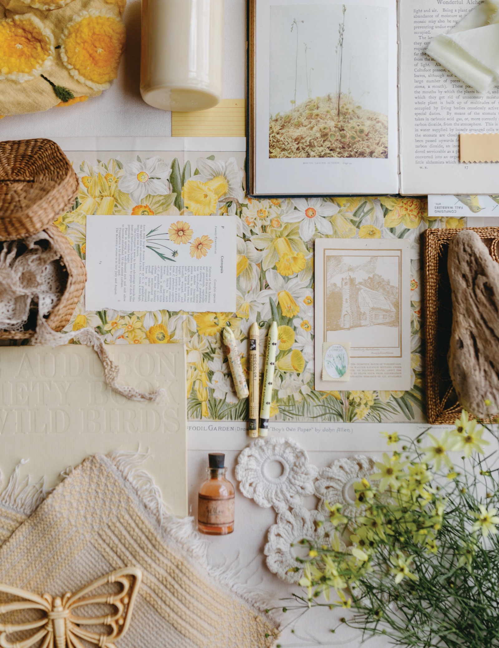
By: Bonnie Christine
Story Adapted From Pattern Magazine – Volume 5
Pattern Magazine is Bonnie Christine's quarterly print and digital publication for surface pattern designers, artists, and creative entrepreneurs who believe that how you live shapes what you make. This story first appeared in Volume 5, Gathering Sunshine, the summer 2026 issue.
Psychology, palettes, and Pantones.
Color tells a story.
It communicates and resonates. A clear teal blue might bring to mind the glacier lake from your family’s favorite hike, just like a bright yellow may remind you of your grandmother’s lemon tree in her backyard. Color draws our attention, and it captures our emotions. In a way, color speaks a language of its own.
What does each color say?
Industry trends ebb and flow, and color swatches come and go. But if you have a clear understanding of color, its emotional influence, and how it plays in the industry, you can design palettes with clarity.
Let’s talk through color psychology, color palettes, and Pantone’s role in design. And as we do, remember that these are not hard-and-fast rules. Color invites truly endless possibilities and a beautiful world to play in and explore.
Color Psychology
Color psychology is the study of how colors interact with us, influencing our emotions and responses. Have you noticed how warm colors like reds, yellows, and oranges are often employed to capture attention? The colors of stop signs, caution tape, and traffic cones signal excitement and energy, drawing our eyes and making us alert. Cool colors like blues, greens, and lavenders, on the other hand, often evoke feelings of calm and are used in design to create peaceful atmospheres. And neutral colors like black, white, cream, and gray can convey sophistication and elegance.
That’s the psychology of color at play.
Color carries emotional weight, and although each individual’s story and geography will shape their unique perception of color, it’s helpful to recognize common psychological connections.
What colors are saying
Red captures our attention. It’s a stimulating color commonly associated with energy, strength, and passion.
Pink is a bit softer, adding a playful, nurturing, and feminine tone.
Orange brings a dynamic energy, with feelings of enthusiasm, friendliness, and encouragement.
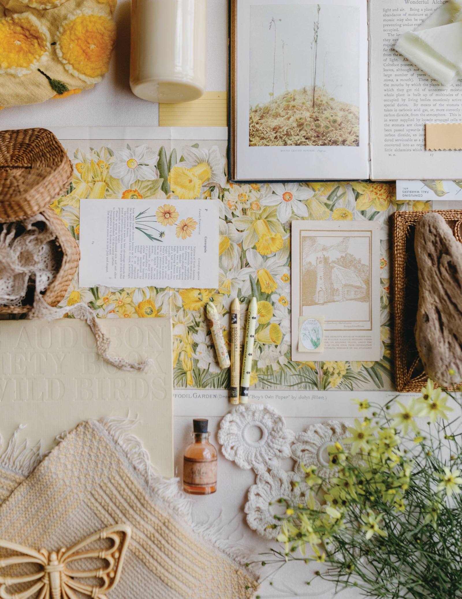
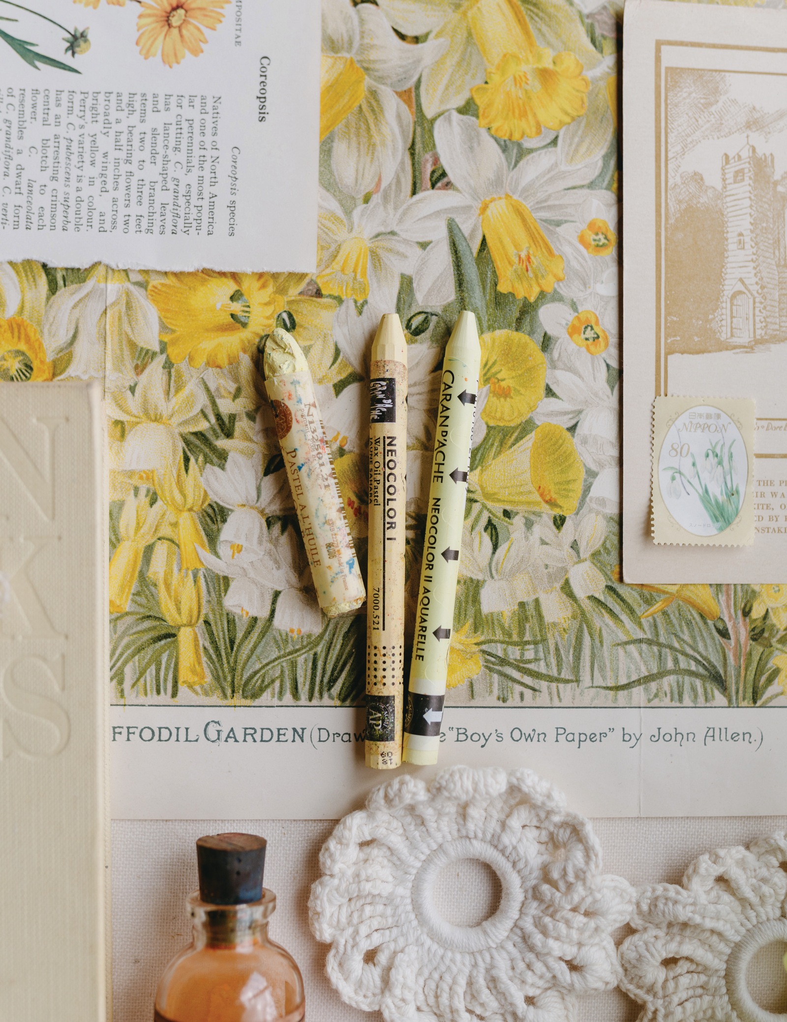
Yellow is eye-catching, a color of joy and sunshine. This color communicates optimism and creativity.
Green brings nature to mind. It carries thoughts of refreshment, health, and tranquility, and is often connected with wealth and growth.
Blue is calming, like the ocean or rivers. It’s a reminder of peace and serenity. Blue is also associated with freedom, wisdom, and loyalty.
Purple reminds us of royalty, a color of luxury. Lighter shades can evoke romance and femininity, while darker shades can feel mysterious.
Brown feels rugged and earthy, a grounding color.
Black is strong, often communicating elegance and power.
White can feel pure and simple. A clean and professional color that can be associated with new beginnings.
When it comes to our creative work, so much of color psychology is influenced by three things: the amount of a particular color, its saturation, and the palette as a whole.
For example, in surface pattern design, it is important to consider how much the color appears in the pattern. Is it your dominant color or an accent color? What is its saturation? Is the color bold and neon, or soft and gentle? How does the color play with the other colors in the palette? Pattern collections often feature several colors in their palettes, inviting variations within each pattern.
As you play with color palettes, consider asking yourself, “What do I want the colors of this to say? How do these colors communicate the story I want to tell?”
So, how does the composition of color shape the palettes we create?
Color Palettes
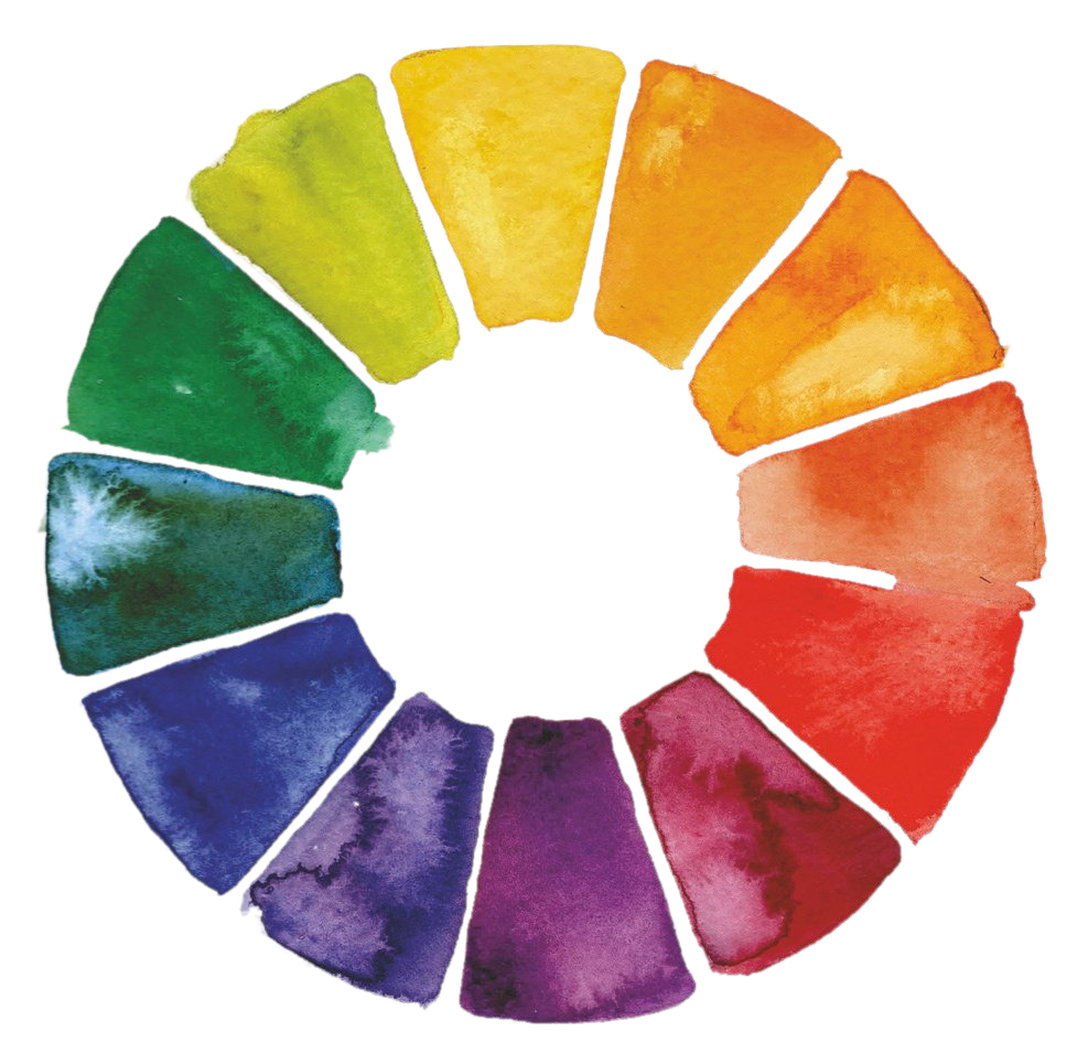
The color wheel is a tool dating back to Sir Isaac Newton, and it is a beautiful roadmap for understanding color relationships. There are three primary colors: red, yellow, and blue. Then there are three secondary colors, made by mixing the primary colors: orange, green, and purple. Tertiary colors are colors that sit between the primary and secondary colors on the color wheel, formed by blending the primary and secondary colors on each side.
Color Harmonies
On the color wheel, there are certain color harmonies that are like recipes for color pairings that work well together.
COMPLEMENTARY COLORS are the colors that sit opposite each other on the color wheel. When you pair them in a design, you’ll create a clear, eye-catching result.
ANALOGOUS COLORS are the neighboring colors on the color wheel. They pair for a more subtle look, which can be ideal for natural or more serene designs.
TRIADIC & TETRADIC COLORS are three or four evenly spaced colors around the color wheel, and can create a balanced, unified palette.
Color Terms
There are a few additional terms that can be helpful to understand as you create your color palettes.
A HUE is a pure color on the color wheel with no black, white, or gray added. There can be warm hues like reds, oranges, and yellows and cool hues like blues, lavenders, and greens.
If you add white to a hue, you’ll increase the color’s lightness and create a tint. If you add black to a hue, you’ll darken the color, creating a shade.
THE VALUE of a color describes how light or dark it is, or where it falls along the continuum from tints to shades. In other words, the value describes how much white or black you’ve added to a hue.
MONOCHROMATIC PALETTES are created from a single hue, a pure color extended through its shades and tints, one color with a range of values.
As you continue creating palettes, you may begin to recognize these color relationships outside of the color wheel. One of my favorite ways to play with color is through nature.
I’ll take three to five photos in my garden or on a walk and then use the eyedropper tool in Adobe Illustrator to select colors from the photos. One photo can provide the most exquisite color harmony: rich greens from the dahlia stem, peachy pinks and soft creams from the petals, and a golden yellow from its center.
Play with color composition. Pull out your paints and a fresh sheet of paper. Start with the primary colors and keep going until your page is filled with swatches dancing across it. Monochromatic palettes of turquoise ... pops of magenta and goldenrod layered side by side.
Color theory gives us a glimpse into color relationships. Now, let’s take one step further and explore how color communication stays consistent across industries.
Color Pantones
When color is printed on different materials, it changes how the colors interact with each other (color theory) and how colors are perceived (color psychology). This is why we have Pantone.
Pantone was established to standardize color reproduction across various industries and countries, making it easier for designers and manufacturers to communicate about color accurately. Pantone has two main systems: the graphic system, used for print and packaging, and the fashion and home system, used for textiles, apparel, and home goods.
Pantone colors serve as a universal language of color, ensuring that the colors you choose and use are accurately reproduced in the final product, regardless of where that product is produced.
When creating color palettes, you can design in CMYK, a color profile often used for print media, represented by the four colors: cyan, magenta, yellow, and black. Or you may design in RGB if you primarily work in digital design. RGB stands for red, green, and blue.
And then you can easily convert your colors from CMYK or RGB to Pantone with a tool called Pantone Connect. I’ve found it helpful to convert to Pantone as the very last step of the design process in Adobe Illustrator before sending the work to production.
Color Call Outs
When collaborating with a manufacturer or a design partner, you may be asked to call out your colors. This request simply means creating a swatch panel alongside your design with each color used in your design. Often designers are asked to include the Pantone color beneath each swatch ... now you know why!
Color tells a story, one that resonates and can bring memories to mind. It’s a world of possibilities, with recipes of color that overlap and interplay. As creatives, we’re invited to step into that world and create beautiful color palettes. And when we’re ready to share our colors with the world, Pantone gives us the language to tell our story consistently across any industry we could imagine.
So, what story will you tell with your next color palette?
Wanting More?
This story comes from Volume 5 of Pattern Magazine, Gathering Sunshine. The whole summer issue, with every story and photograph, is at bonniechristine.com/patternmagazine.
Get The Pattern Post in your inbox
The week’s news from the creative industry, with my spin on it, every Tuesday. Free, and yours to pause whenever you like.
We honor your email. We will never sell your information, for any reason.